Playful Simplicity
Whenever people say ‘less is more’, the majority of us tend to nod our heads in agreement. It gives us a false feeling of contentment that we all have the same perception of “less-is-more” or, in another term, “understated elegance”. But the truth is that some people don’t actually know what simple elegance is. I’ll agree – there is a fine line between an empty space and a well designed element.
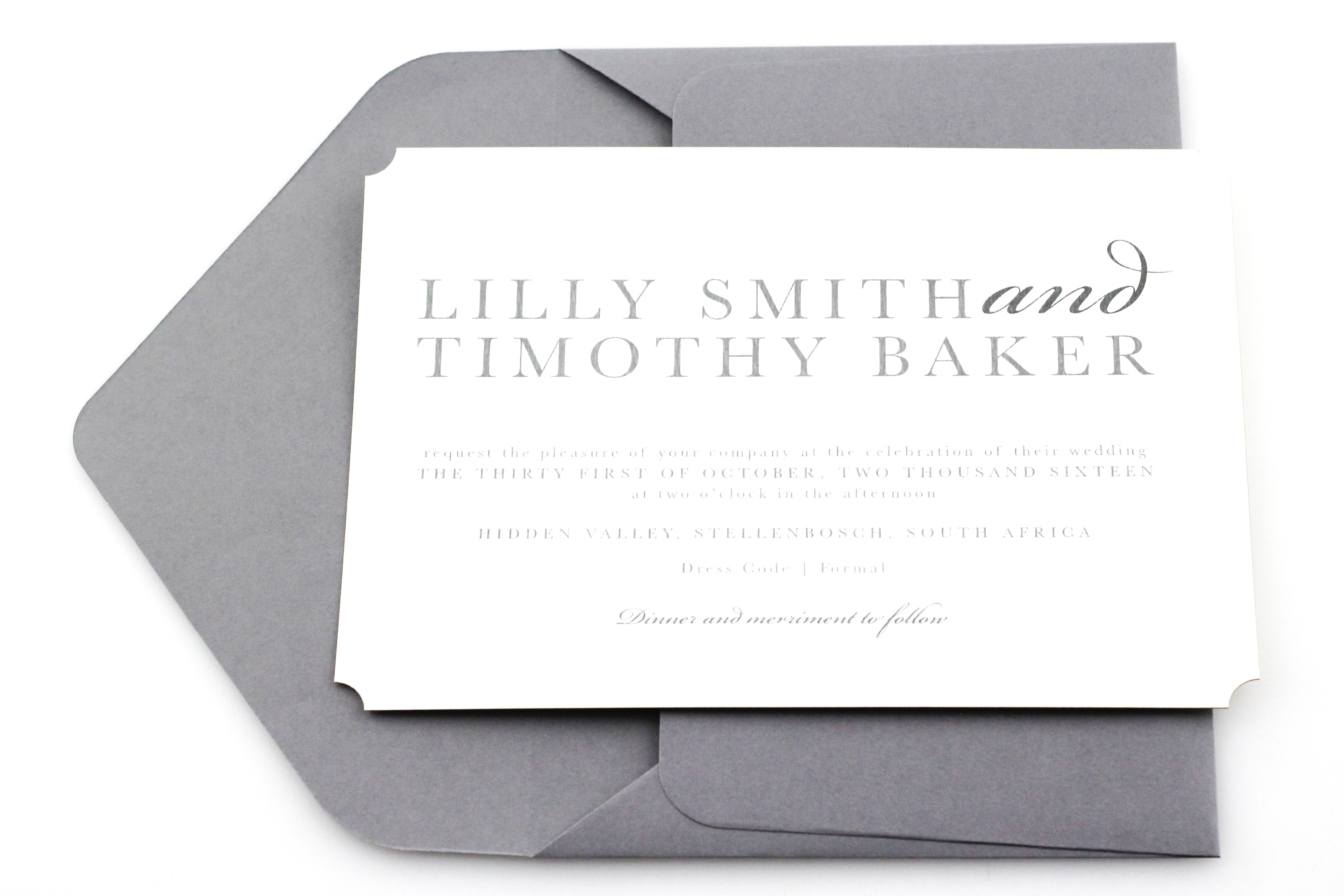
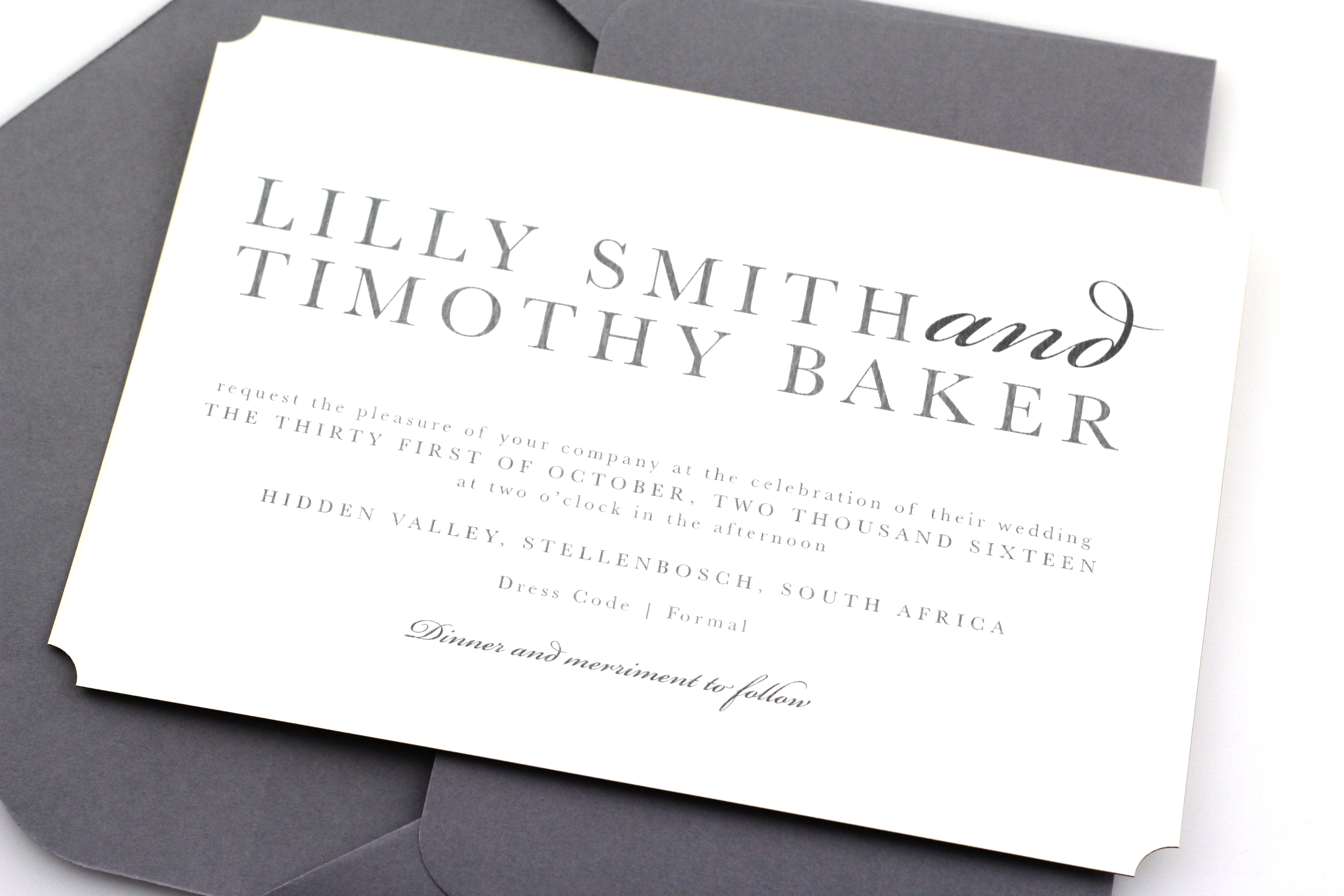
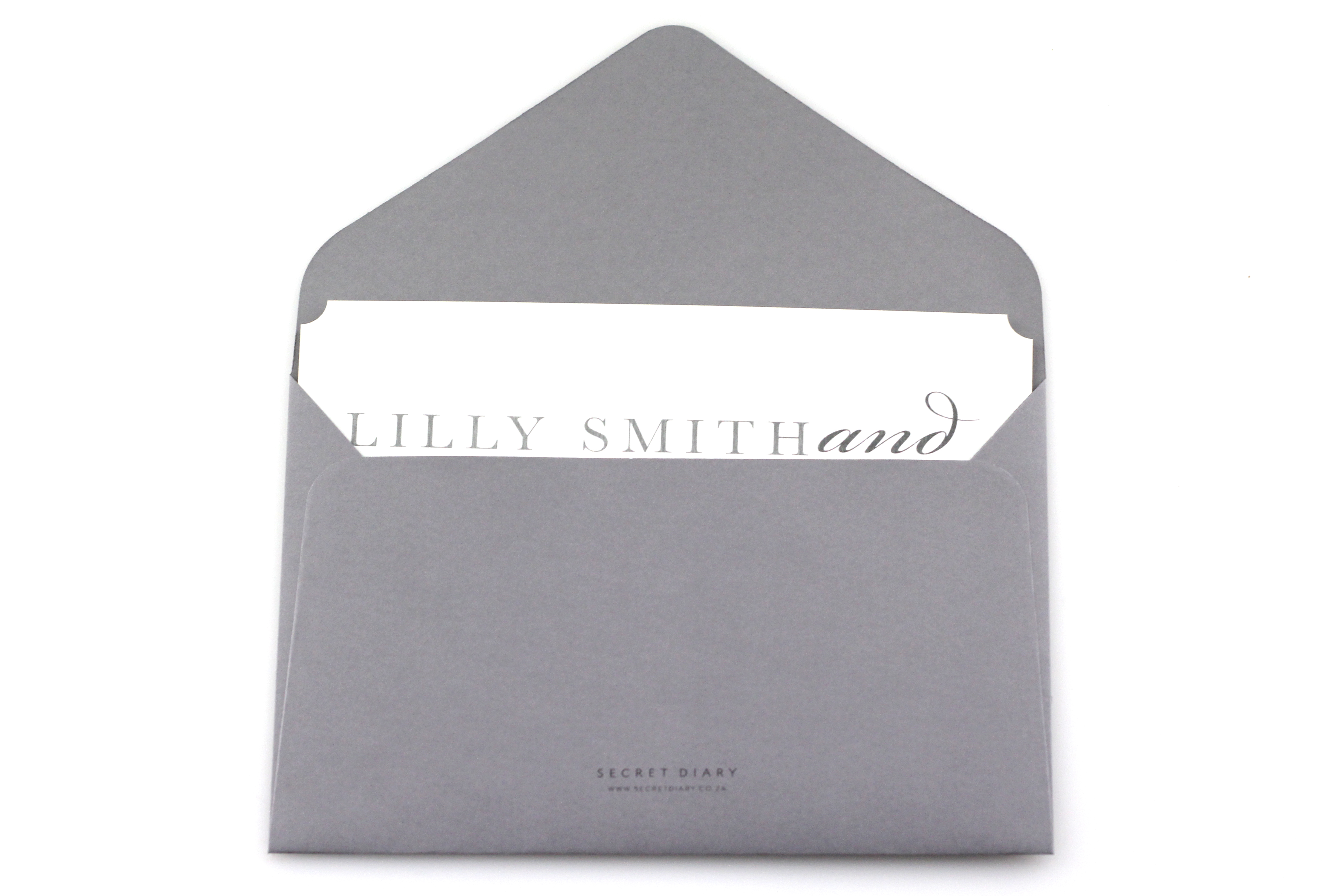
For instance, I have found that with event invitations in general, people always tend to shy away from clean design with adequate white space. Instead, they fill up the invite with curls and frills. But possibly, the most rewarding feeling for me comes from seeing a really well designed area of white space; the kind of space that doesn’t feel too empty, or too full. It’s the kind of space your eye can travel around for ages without ever feeling restrained or bored.
I think this invite that we have designed illustrates that design principle well. There are only a selection of two different typefaces that compliment each other; not 4 or 5 different ones which completely contrast each other. The playful aspect of this invite is that, if it feels too understated for you, you can play around with all kinds of finishes, such as letter pressing or foiling. The good news is that any kind of extra added effect, will demand a fair amount of attention, because there is nothing else to clutter the space.
The colour palette also offers freedom as grey and white are neutral colours that can be paired with almost any other colours.