Letter Pressed Enchantment
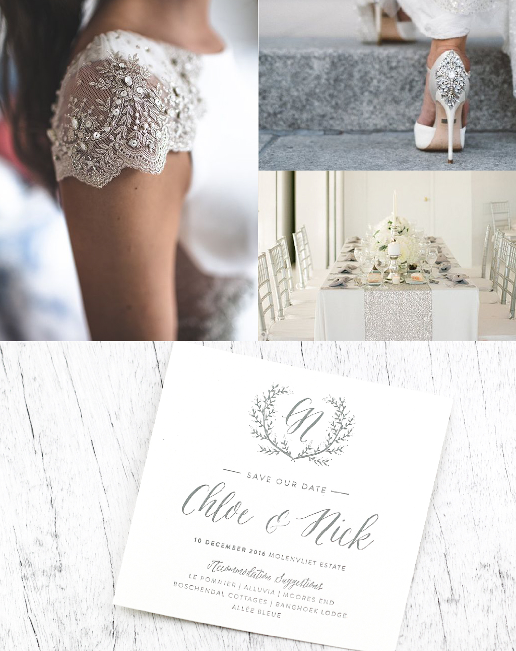
When one pairs new with old, you have to have an exceptional eye for putting certain elements together. The elements need to provide a contrast to one another while still creating a kind of harmony, which tends to be difficult to get right. Perhaps the main principle of design, when it comes to this overlapping of different time periods, is to keep the design relatively clean, so that each element gets the spotlight equally.
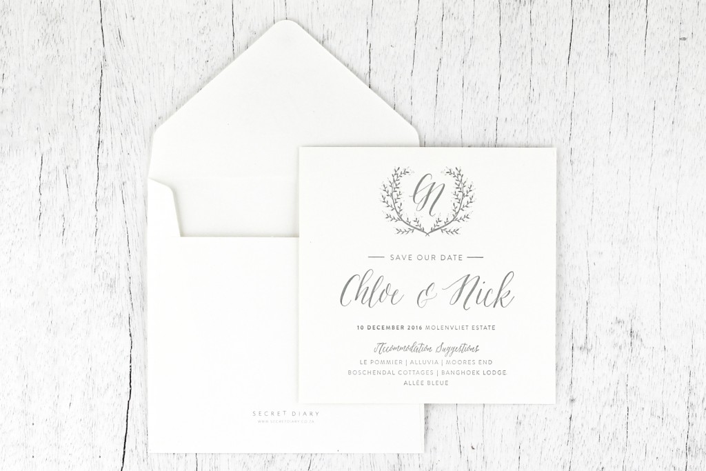
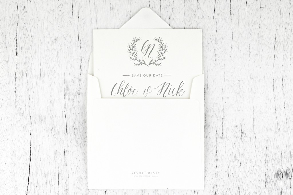
This flat, square card emphasises again just how beautiful and powerful the old printing technique of letter pressing really is. The impression that the letter pressing makes into the paper accentuates the hand-crafted feel of the save-the-date. The overall design is contemporary, with two contrasting typefaces being used. The sans serif typeface conveys the sense of modernity while the script typeface conveys a warmer, more romantic appeal.
So throughout, the save-the-date has the underlying theme of contrast, which is what makes it so attractive to the naked eye. The colour palette is dove grey and white – two neutral colours that can be seamlessly integrated into any other colour platte. The dove grey also works well when paired with gold, silver or even rose gold foiling, as another option.