Bold Botanique
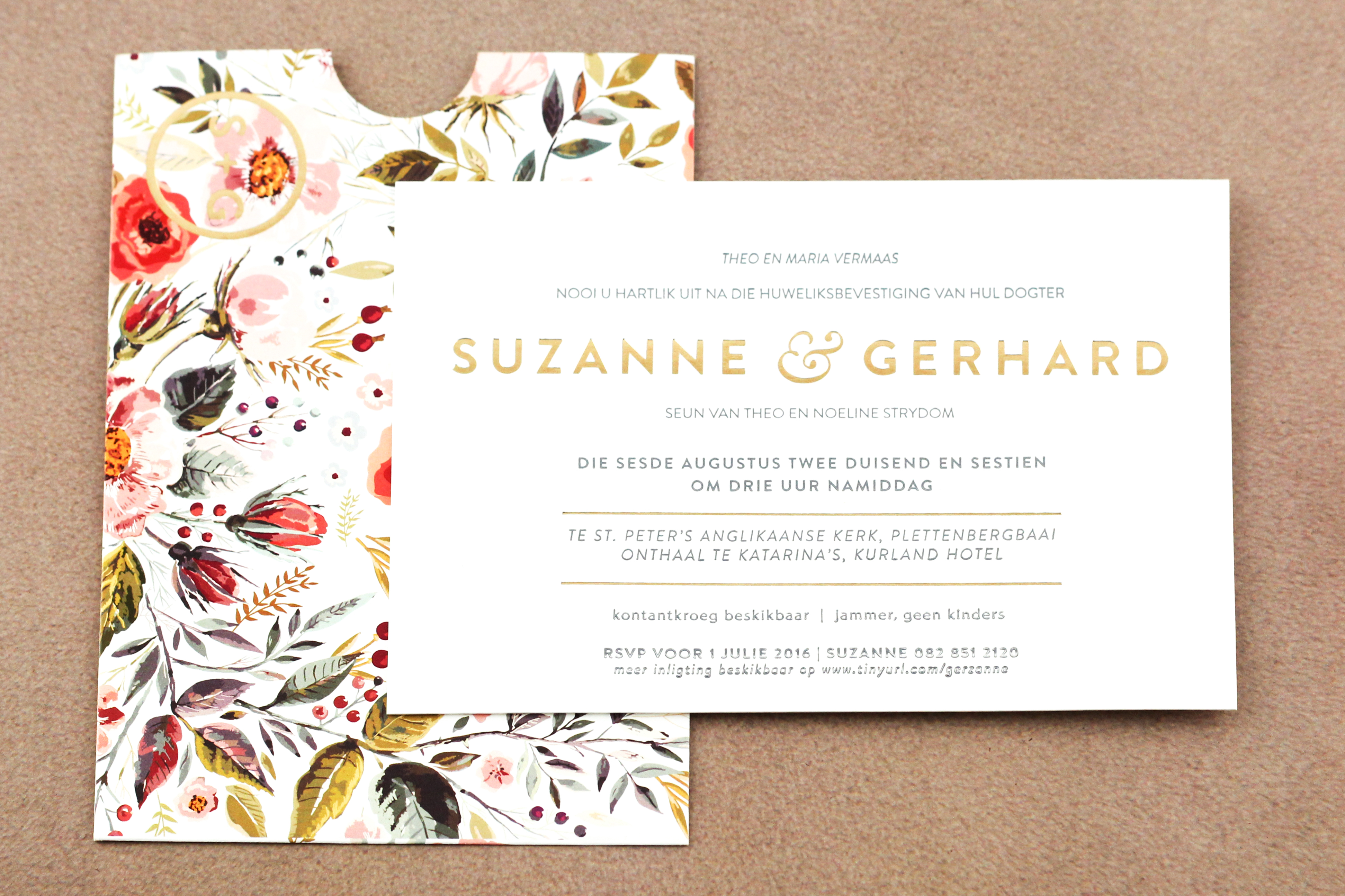
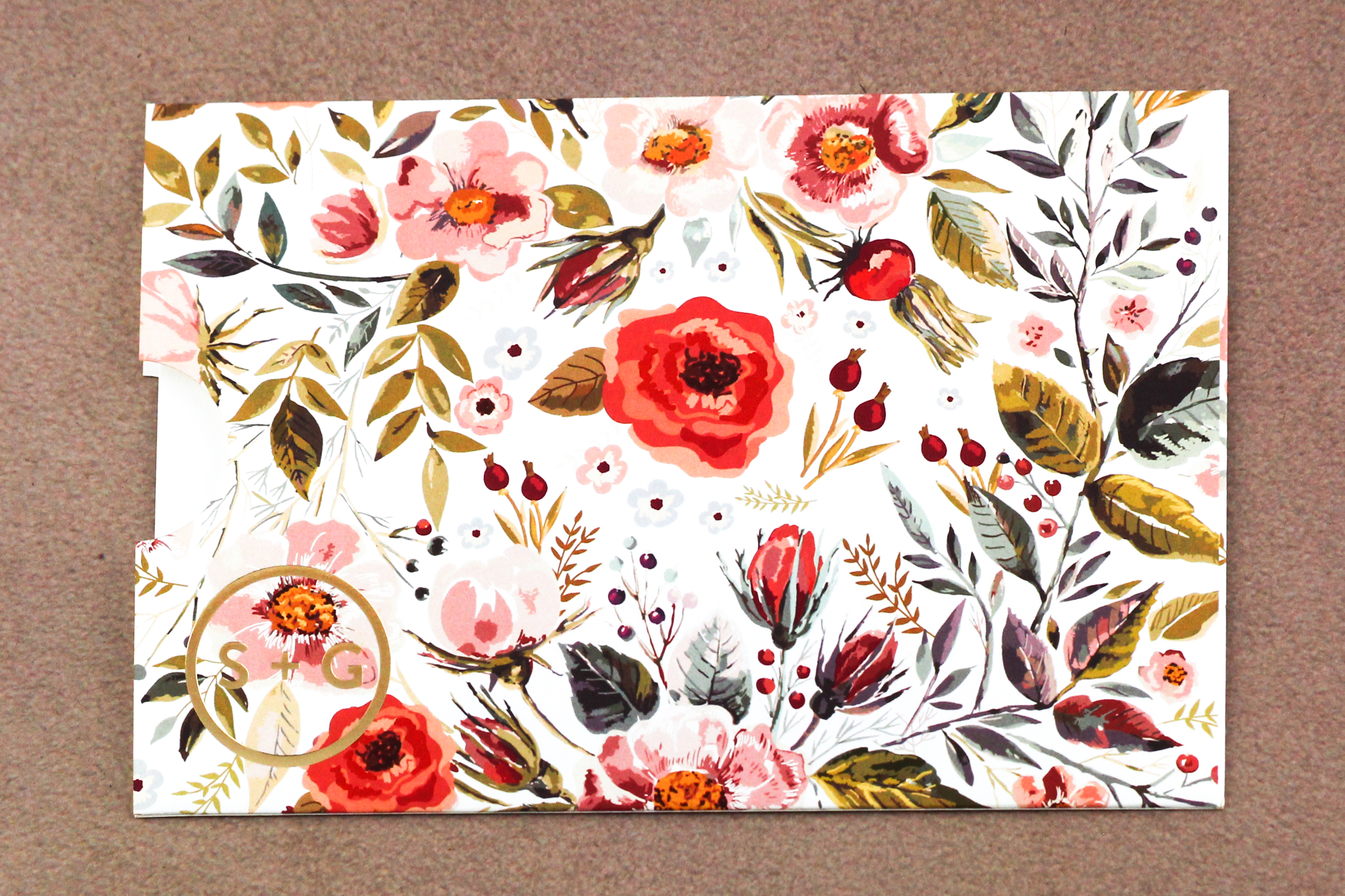
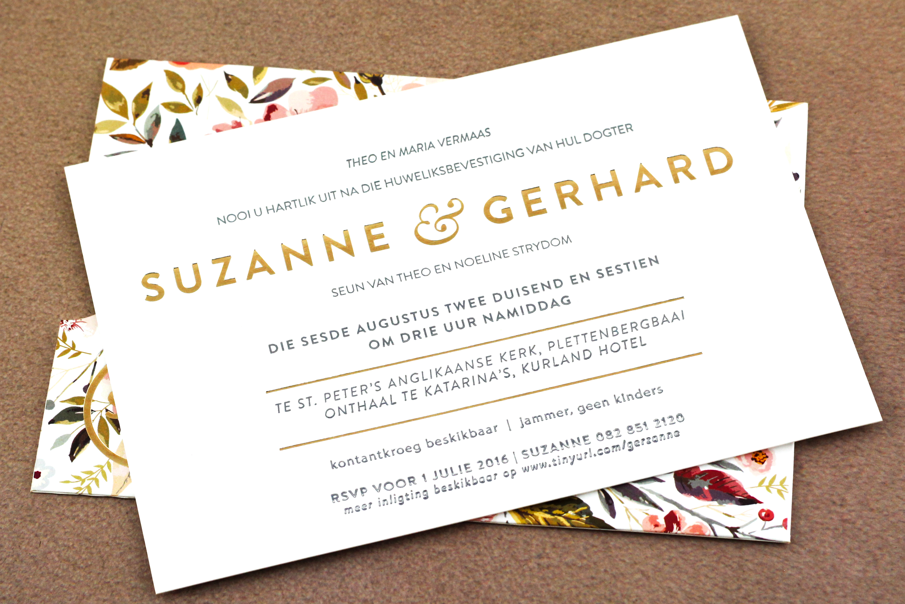
I am an avid lover of modern design. I love the simplicity, the elegance, the balance and structure that is often consistent with most modern design elements. But a part of me also really loves the warmth and friendliness of hand crafted or hand illustrated; something that is often dismissed or overlooked in today’s age. So when I met a couple who wanted a modern wedding invitation with a floral influence, I was pretty happy – it is essentially the perfect match, even though the styles contrast each other. The invite consists of a floral, gold foiled pocket and inside the pocket is an invite – gold foiled and letter pressed. The pocket is done in a hand drawn water colour illustration style, and the couple’s elegant and simple monogram is found on the bottom left hand corner.
What I really love about the pocket is the art and intricacy of the floral illustration, paired with the clean and modern monogram, that creates a kind of harmony. The gold foil juxtaposed to the watercolour floral illustration really demands your attention with its soft, warm shimmers. The invite itself conveys a complete sense of calm and tranquility when sliding it out of the pocket – it is entirely type composed, and perhaps that’s what makes it so visually striking. The fact that ancient printing techniques such as letter pressing are used, brings a kind of warmth that one wouldn’t expect from a contemporary design.
For the invite, I used mainly grey as a base colour for the text – it is so elegant, and black proved to be too harsh on such a soft palette. Then we added a touch of gold foiling, for the couple’s names and lines within the body copy. I feel that this invite ties together all the parts of the modern world that we love, along with all the older patterns and techniques that we still yearn for.